The NBA and Nike unveiled the 2022–23 NBA City Edition uniforms. We ranked them from worst to best.
The sixth annual launch of the NBA’s Nike City Edition uniforms are here. The jerseys have been in the design stages since the summer of 2020. The theme this season focuses on the stories, history and heritage that make each NBA franchise unique. The Crossover ranked each from worst to best.
You can find the previous rankings here: 2021, 2020, 2019, 2018 and 2017.
INC: Utah Jazz
Jersey facts: The Jazz are not part of this roundup after introducing four new uniforms before the season.
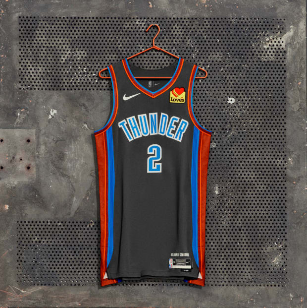
29. Oklahoma City Thunder
Courtesy of Nike
Jersey facts: The uniform honors the people of Oklahoma through a depiction of “the Standard,” a set of values built on service, honor and kindness. That Standard is printed inside the uniform, under the chest.
SI’s take: Ban gray-based uniforms, please!!
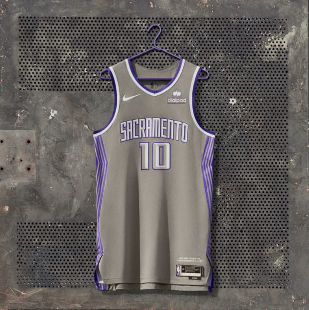
28. Sacramento Kings
Courtesy of Nike
Jersey facts: “Sacramento” is on the front of the jersey for the first time since 2016. And for the first time in franchise history, the Kings have a gray uniform, a color inspired by the Golden 1 Center.
SI’s take: See Thunder.
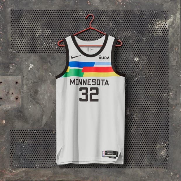
27. Minnesota Timberwolves
Courtesy of Nike
Jersey facts: An artistic statement, the uniform is a colorful representation of the diverse, creative community that resides across the state. Every uniform is one-of-a-kind, featuring a unique chest pattern.
SI’s take: Minnesota had a good thing going with the “Purple Rain” uniforms a few years back. It’s cool that every uniform will be slightly different, but that’s about it.
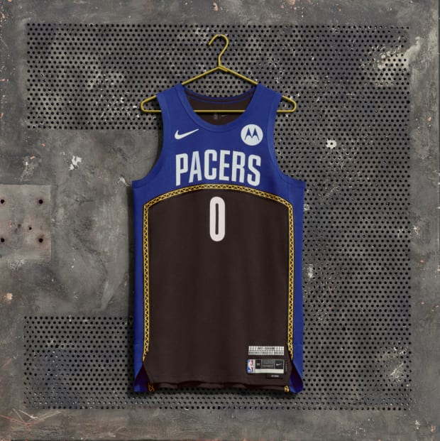
26. Indiana Pacers
Courtesy of Nike
Jersey facts: Among the cathedrals of basketball throughout the state that grew basketball, the uniform celebrates the past and present of Gainbridge Fieldhouse with the theme “Built for Basketball.”
SI’s take: The Indiana Fever had a Stranger Things theme uniform this past season! Missed opportunity not giving us a Vecna uni.
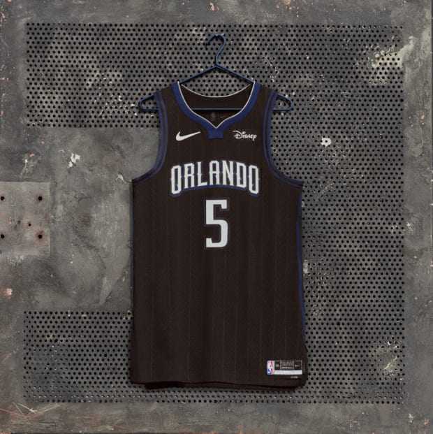
25. Orlando Magic
Courtesy of Nike
Jersey facts: The all-black uniform reveals a metallic gray accent, evoking a suit of armor.
SI’s take: Magic kept it simple. Too simple.
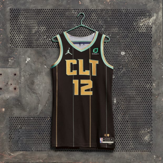
24. Charlotte Hornets
Courtesy of Nike
Jersey facts: The uniform returns to the mint, gold and granite color scheme from the 2020–21 season. Most notably, “CLT” appears on the uniform for the first time, embracing the familiar airport abbreviation.
SI’s take: Good colorway, but the “CLT” throws me off a bit.
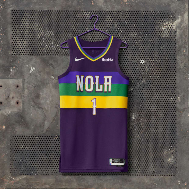
23. New Orleans Pelicans
Courtesy of Nike
Jersey facts: The uniform features the colors of the Mardi Gras season: purple, green and gold.
SI’s take: Not a bad uniform at all. Just feel like it’s not much different than what we have seen before for the Pelicans.
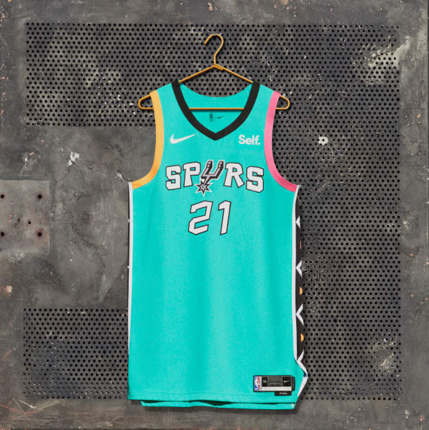
22. San Antonio Spurs
Courtesy of Nike
Jersey facts: The uniform is inspired by the bold and colorful style featured during the 1996 NBA All-Star Game in San Antonio.
SI’s take: The 1996 All-Star Game was one of the most fashionable ASGs of all time. But not sure how I feel about seeing the uni multiple times in a season.
Watch the NBA all season long with fuboTV. Start your free trial today.
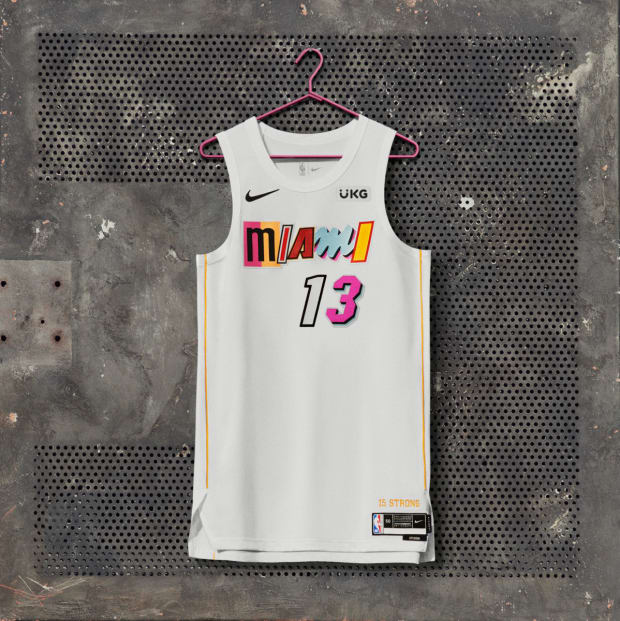
21. Miami Heat
Courtesy of Nike
Jersey facts: The uniform is a follow-up to last season’s mash-up concept and swaps black for white as its base color while keeping all the other original design elements intact.
SI’s take: The Heat were a fan favorite every year with their “Vice City” uniforms. Not a big fan of the mash-up concept, but it does look better than the black-based ones.
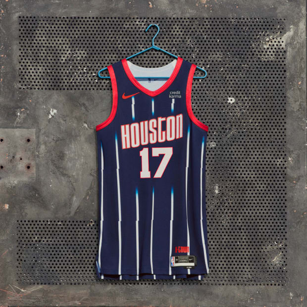
20. Houston Rockets
Courtesy of Nike
Jersey facts: Bringing back last year’s design, this year’s uniform reminds Rockets fans of the rich history of the franchise.
SI’s take: Great uniform but the Rockets lose points for bringing back the same uniform from last year.
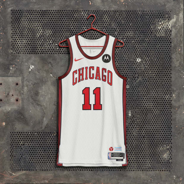
19. Chicago Bulls
Courtesy of Nike
Jersey facts: The uniform is an ode to Chicago’s iconic architecture through the lens of the Chicago municipal “Y” symbol, which was introduced in 1917.
SI’s take: A very clean look but I feel like it’s too safe.
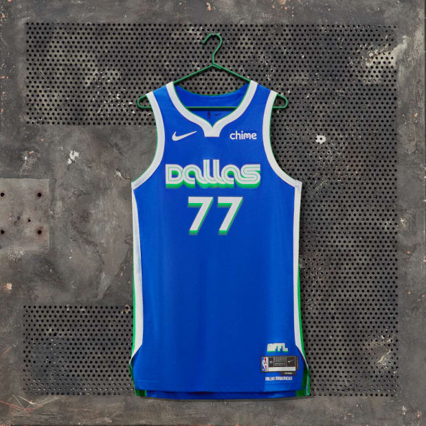
18. Dallas Mavericks
Courtesy of Nike
Jersey facts: To celebrate the history of the Metroplex in their uniform, the Mavericks graphically turned back the clock to the retro fashion aesthetic of the late 1970s and early ’80s.
SI’s take: Great wordmark but wish there were more design details on the rest of the uniform.
17. Denver Nuggets
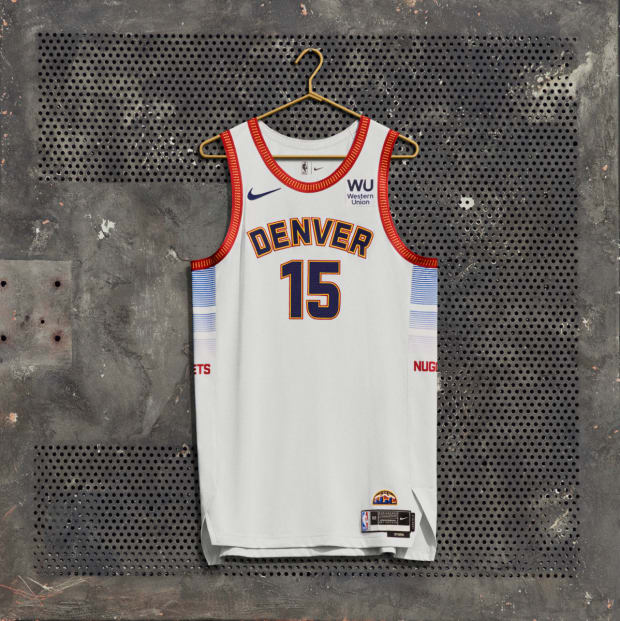
Courtesy of Nike
Jersey facts: The uniform’s design draws from the mile-high city’s iconic architecture, such as the bold “DENVER” lettering on the front of the jersey, a tribute to the revered neon sign at Union Station.
SI’s take: Clean look and I like the details on the collar.
16. Los Angeles Clippers
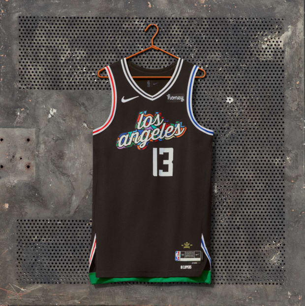
Courtesy of Nike
Jersey facts: The uniform celebrates the team’s deeply rooted bond with the South L.A. community, as well as the heritage and passionate spirit of the Drew League, the city’s most beloved community basketball league. The colorful mosaic design on the chest is inspired by the iconic Watts Towers, and the wordmark combines classic scripts from the Clippers and the Drew.
SI’s take: I love that Nike and the Clippers pay homage to the Drew League, but it’s also a bit awkward that the Drew League signed a partnership with Adidas this past spring.
15. Philadelphia 76ers
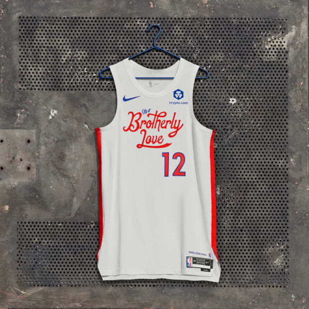
Courtesy of Nike
Jersey facts: The simple, clean design of the uniform honors the franchise’s rich basketball history.
SI’s take: Clean design and love the retro “City of Brotherly Love” wordmark, but feels like something is missing.
14. Golden State Warriors
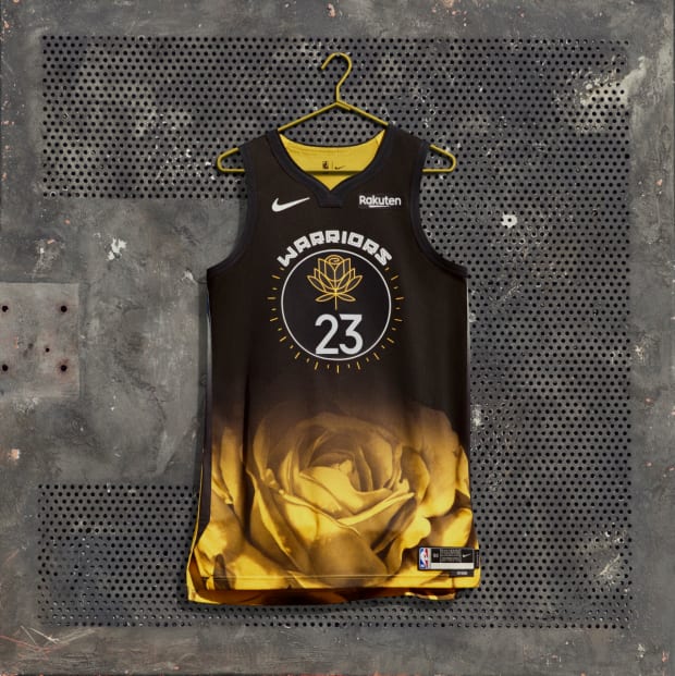
Courtesy of Nike
Jersey facts: Designed by Bay Area artist Allison “Hueman” Torneros, the uniform features a yellow rose as its graphic centerpiece, representing women who change the game and lead fearlessly.
SI’s take: I feel like this is going to be one of the most talked about uniforms. I love the design inspiration. It’s a bold look for the reigning champions.
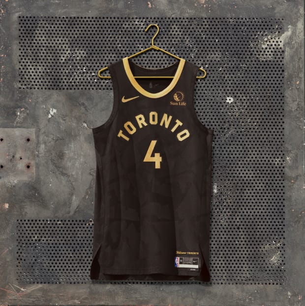
13. Toronto Raptors
Courtesy of Nike
Jersey facts: With classic black-and-gold styling and subtle details, the uniform nods to the diversity and unity of Toronto. The city’s six boroughs are deconstructed to make an embossed pattern on the base.
SI’s take: The “OVO” inspired uniforms are a fan favorite, so I get why the team has kept the theme going.
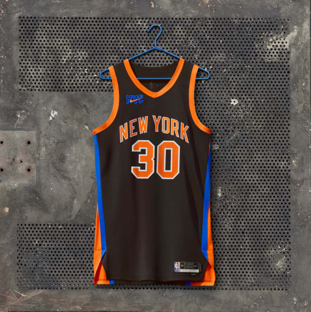
12. New York Knicks
Courtesy of Nike
Jersey facts: The uniform is inspired by the memorable Knicks teams from the late 1990s and early 2000s. Designed in partnership with Kith, this uniform is a throwback to those teams.
SI’s take: I dig the Kith partnership, but I just want the classic black-trim uniforms back full time.
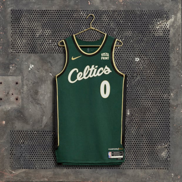
11. Boston Celtics
Courtesy of Nike
Jersey facts: The uniform pays homage to Bill Russell, the 11-time champion and HOF center who defined the gold standard of what being a Celtic truly means.
SI’s take: It always feels weird to see Boston in a different uniform besides their standard home and away uniforms. But they did a good job paying homage to the late great Bill Russell.
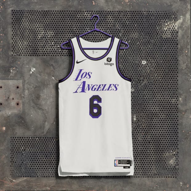
10. Los Angeles Lakers
Courtesy of Nike
Jersey facts: Los Angeles is a city where artists know how to transform a blank page into a world of possibility. That’s the spirit behind this year’s uniform.
SI’s take: Simple design but it works for the Lakers.
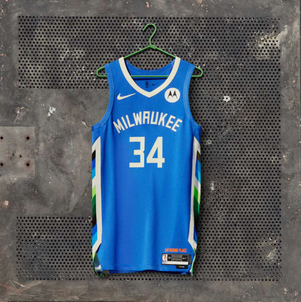
9. Milwaukee Bucks
Courtesy of Nike
Jersey facts: The uniform embodies the spirit of Bronzeville, one of the most diverse and distinctive neighborhoods in Milwaukee. Historically, it was the city’s African American economic, social and artistic hub.
SI’s take: I feel like we are going to see this uniform a bunch as Giannis Antetokounmpo continues to wreak havoc on the NBA this season.
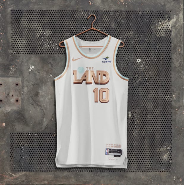
8. Cleveland Cavaliers
Courtesy of Nike
Jersey facts: The uniform draws inspiration from the physical makeup of northeast Ohio. It showcases the wordmark “The Land,” further connecting this uniform and team back to the city. The graphic is reminiscent of vintage Cavs logos from the 1980s, with a blue ball that represents the sunny shores of Lake Erie and tiered brown tones that take inspiration from the area’s soil.
SI’s take: Love this look for one of the most exciting teams in the league. It’s a very minimal design from artist Daniel Arsham but fresh.
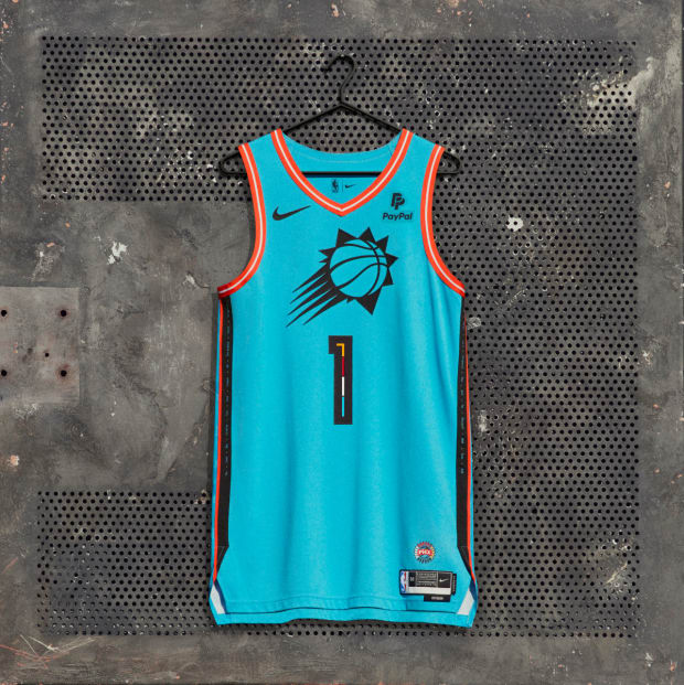
7. Phoenix Suns
Courtesy of Nike
Jersey facts: The uniform features elements of each of the 22 tribal nations of Arizona, honoring the Indigenous communities that have shaped the land. The jersey nods to rez ball, a fast-paced style of play. The uniform’s turquoise base color represents the protection stone, which carries special meaning among the local Indigenous communities. The chest features the Suns’ primary sunburst logo.
SI’s take: A+ storytelling.
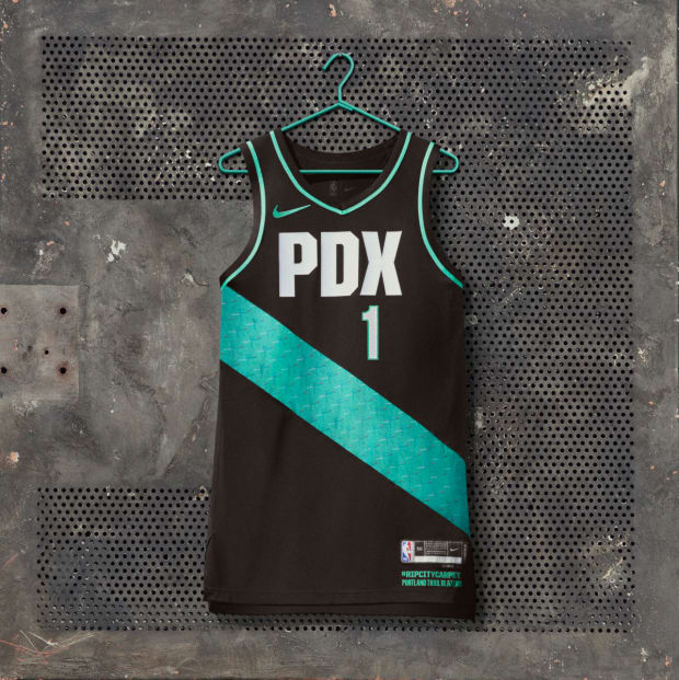
6. Portland Trail Blazers
Courtesy of Nike
Jersey facts: This uniform proudly pays homage to the signature PDX carpet pattern, which reached local icon status in the 1990s and falls into the “uniquely Portland” category.
SI’s take: The City Edition uniforms are all about having fun with themes. Portland gets it.
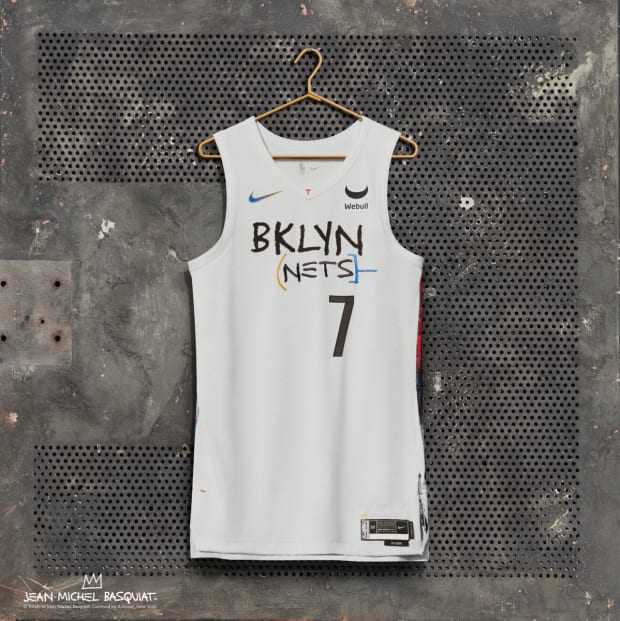
5. Brooklyn Nets
Courtesy of Nike
Jersey facts: The uniform brings back a fan favorite with a new twist. Flipping from black to white this year, the Nets once again pay tribute to legendary Brooklyn-born artist Jean-Michel Basquiat.
SI’s take: A fan favorite from last year. Love the colorful side panels, while the shorts feature Basquiat’s distinctive crown motif.
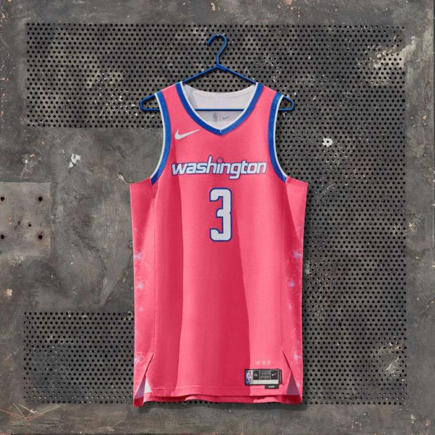
4. Washington Wizards
Courtesy of Nike
Jersey facts: With a pink base and white accents throughout, the uniform pays tribute to the city’s iconic cherry blossoms.
SI’s take: These grab your attention, and it’s a great way to pay homage to the city’s cherry blossoms.
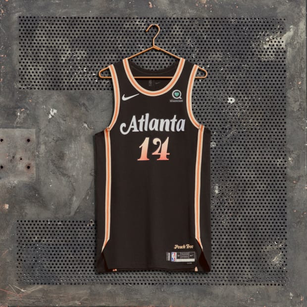
3. Atlanta Hawks
Courtesy of Nike
Jersey facts: A fresh take on the team’s original Peachtree uniform, which launched three years ago. The jersey and shorts colors—a gradient from Electro Peach to Sunset Haze—and design represent the high energy and awesome diversity of the city, based on the foundation of what makes Atlanta great.
SI’s take: There is just something special about the Peachtree uniform every year. The colorway is undefeated.
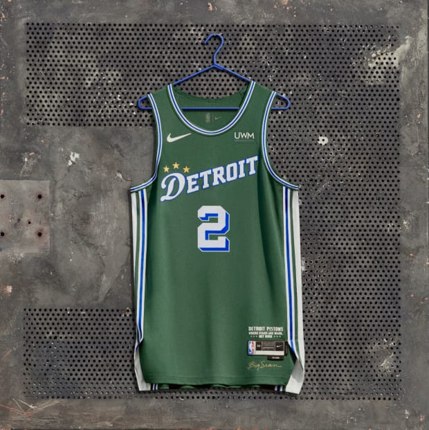
2. Detroit Pistons
Courtesy of Nike
Jersey facts: Designed in collaboration with Pistons Creative Director of Innovation Big Sean, this uniform pays tribute to the gym at Saint Cecilia’s (aka “the Saint”), where many legends have played. The uniform’s green color represents the walls of the gym. A trio of stars on the jersey and shorts symbolizes the Pistons’ three NBA championships.
SI’s take: This is what the city edition uniform is all about. The storytelling on this jersey is just magnificent. Kudos to Big Sean.
1. Memphis Grizzlies
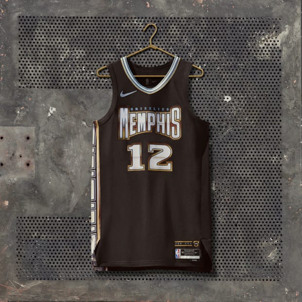
Courtesy of Nike
Jersey facts: The uniform serves as a tribute to the musical artists and albums that define Memphis hip-hop and its raw sound. Highlighted by chrome-inspired detailing and diamond textures, the design was inspired by local hip-hop album art and pulls in colors like the traditional Beale Street Blue framing Grizzlies. Just above the jock tag, a Grizzlies grill and “For the M” represent the pride Memphians have for their music, their team and their city.
SI’s take: This is not the first time I have ranked the Grizz at No. 1. Memphis is the coolest team in the NBA, and it’s not even close. From coming out of the tunnel to rap performances to having one of the game’s most electrifying superstars in Ja Morant, the franchise just gets it.
It is not scared to have fun, and you can tell the players really embrace the city and its themes. The grill takes this jersey over the top.
More NBA Coverage: